Amazon Kids+ on Alexa App
Designing the Amazon Kids+ subscription upsell experience on the Alexa mobile app (iOS), driving higher conversions and clearer value communication for parents.
Overview
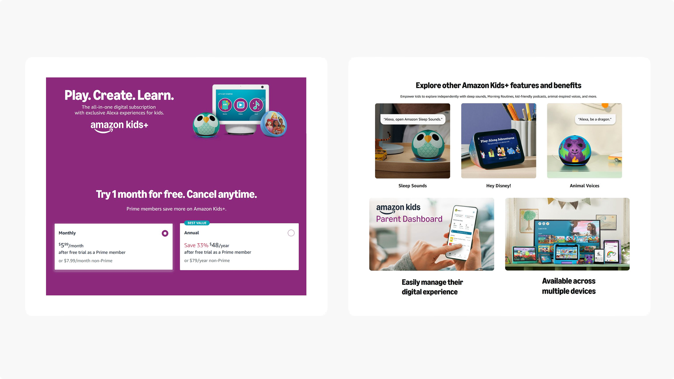
Amazon Kids+ is an all-in-one digital subscription that gives kids ages 3–12 access to kid-friendly content across Alexa-enabled devices. This project focused on designing the subscription upsell experience within the Alexa app on iOS — identifying the right moments to surface the offer, communicating its value, and guiding parents through a frictionless purchase flow.
Business Opportunity
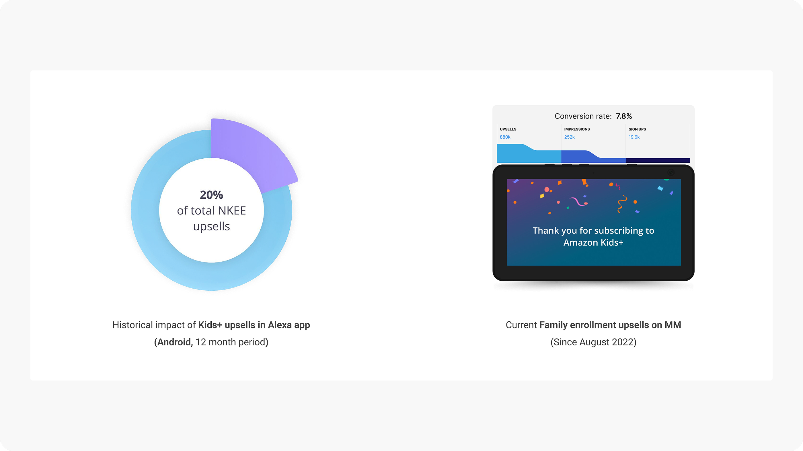
The Alexa app presented a significant untapped channel for Kids+ subscriptions. Historical data showed Kids+ upsells already accounted for 20% of total NKEE upsells on the Android Alexa app over a 12-month period. Family enrollment upsells on multimodal devices since August 2022 demonstrated strong conversion potential — validating the opportunity to bring this experience to iOS.
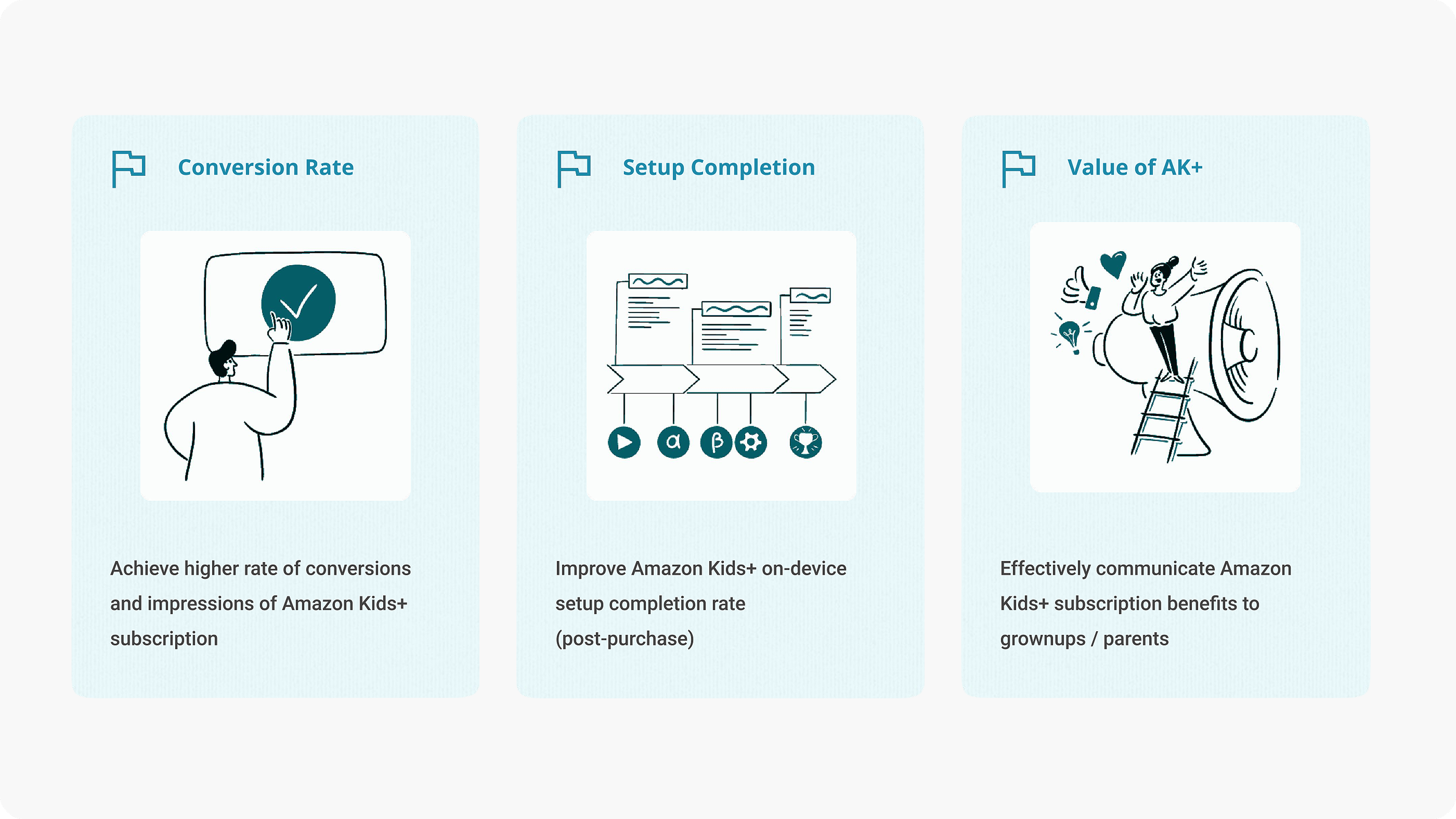
Goals
Aligning business conversion targets with the real user problem — parents didn’t understand what Kids+ offered or why it was worth signing up.
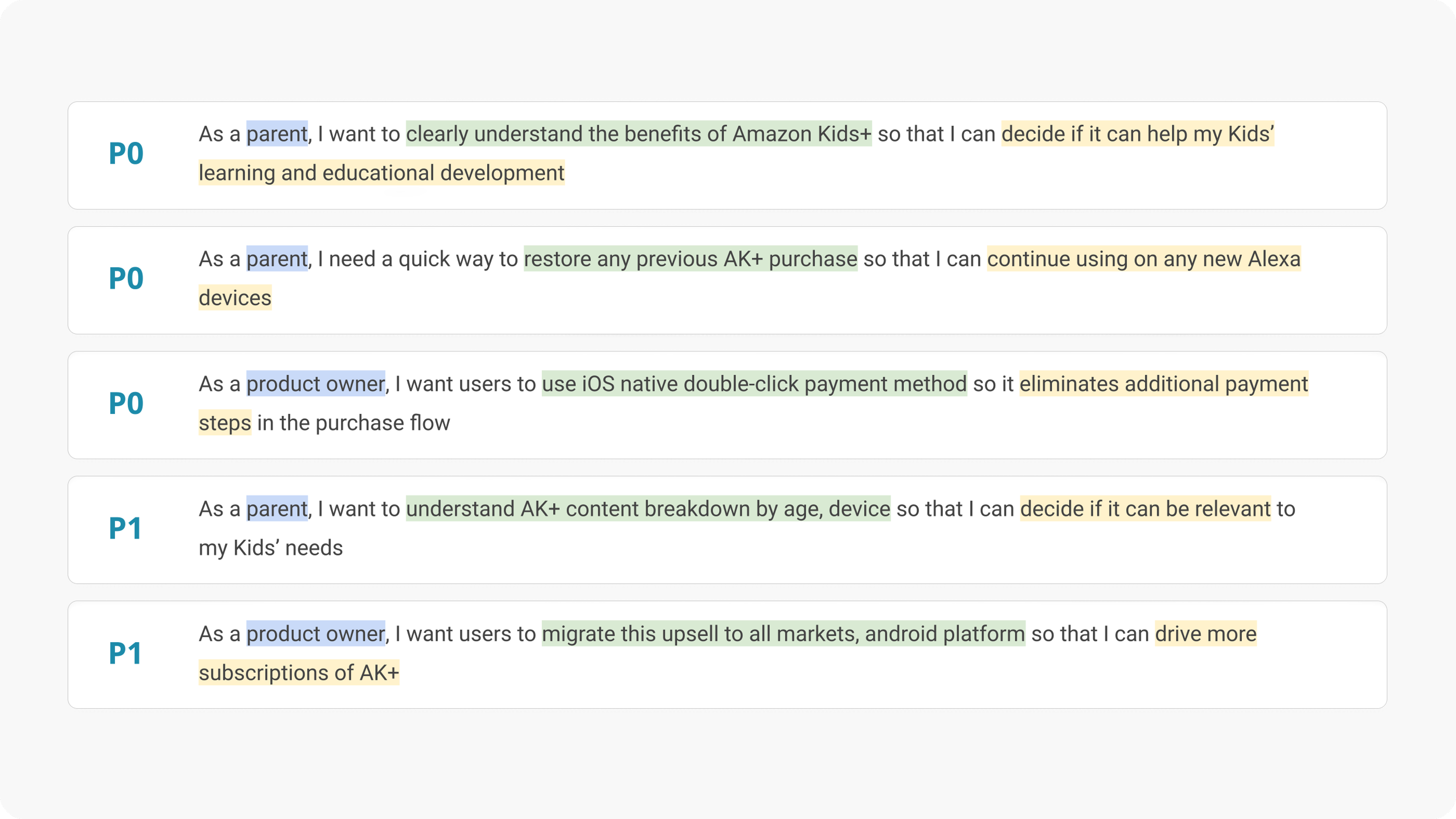
Key Requirements
User stories mapped to prioritized goals — capturing what parents and product owners need, why, and what success looks like.
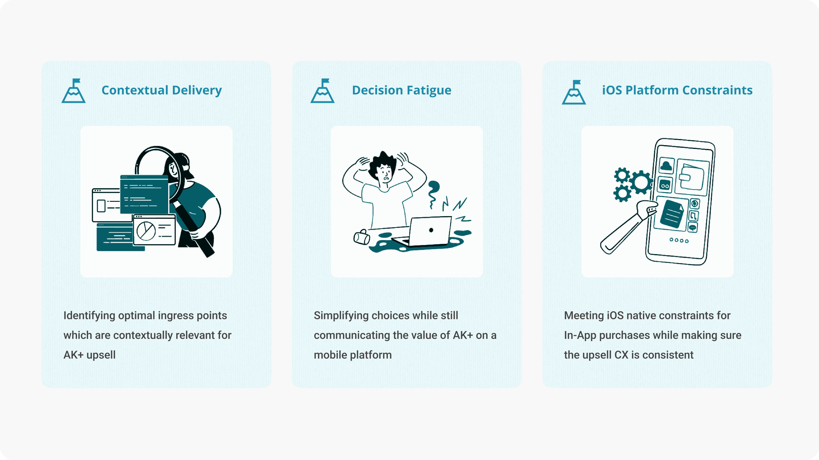
Challenges
Surfacing the right offer at the right moment, keeping it simple enough to act on, and working within iOS In-App purchase constraints.
Research
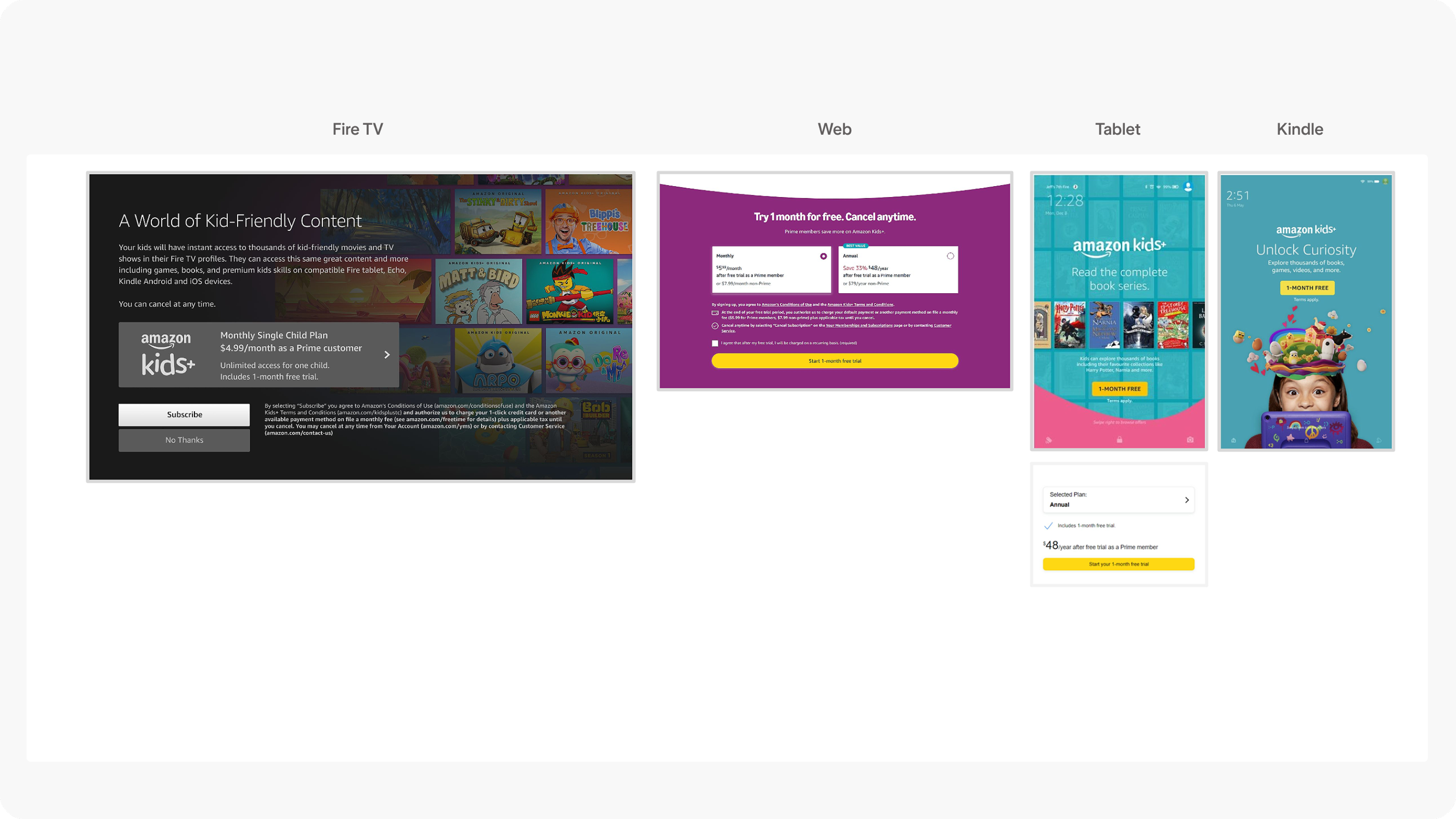
Auditing existing upsells across platforms
We started by auditing existing Kids+ upsell experiences across Kids Fire TV, web detail pages, and tablet — identifying inconsistencies in messaging, branding, and feature communication.
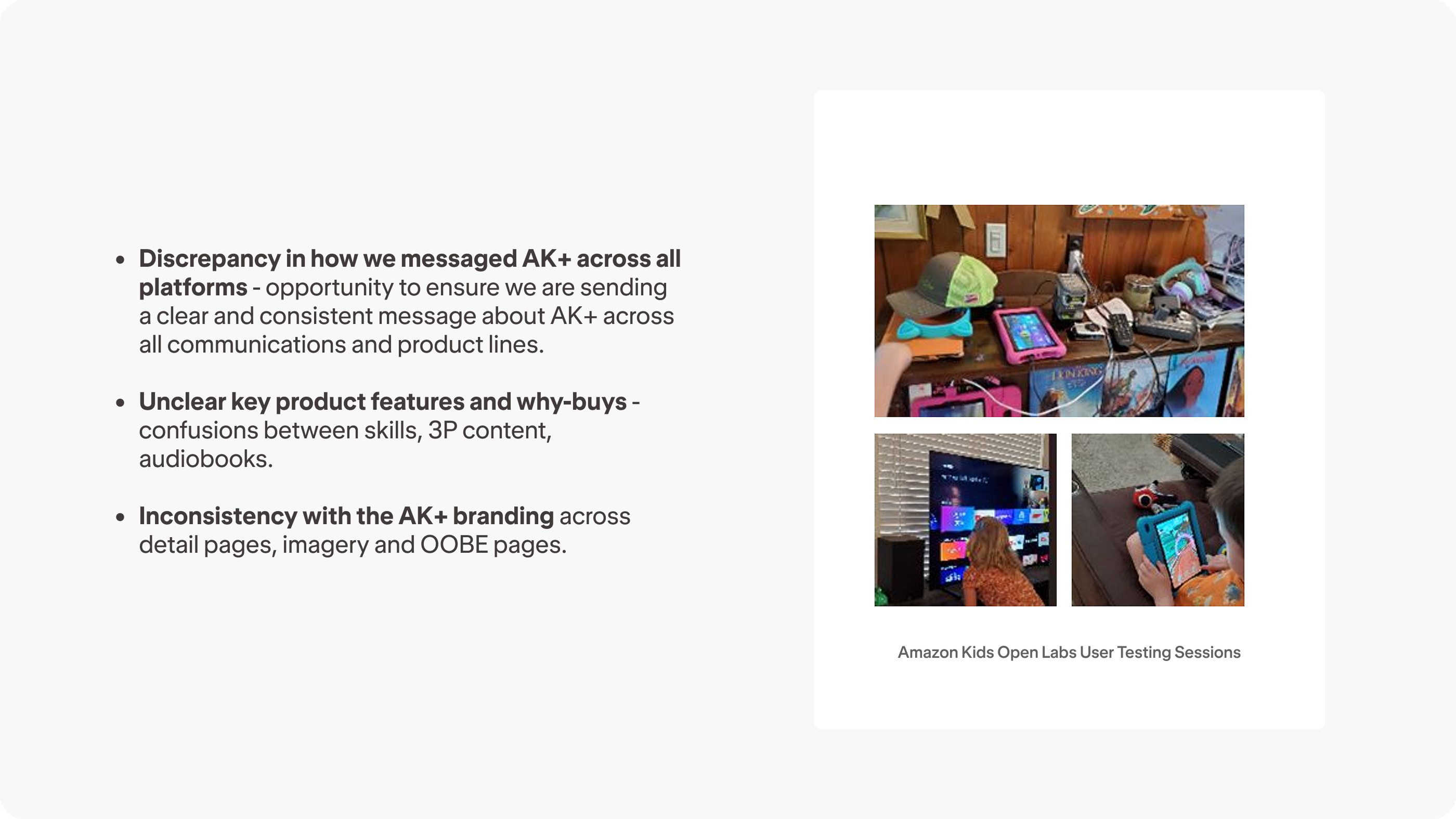
User research insights
Kids Open Labs studies and Walk-the-store sessions revealed inconsistent messaging, unclear feature differentiation, and branding gaps across platforms — a clear opportunity to unify the AK+ story.
Design Process
Ingress strategy
I mapped out upsell ingress points after Family enrollment, based on device metrics (headless vs. multimodal) and whether the user was going through first-time setup (FTUE) or was a returning user (OOBE).
Additional ingress discovery
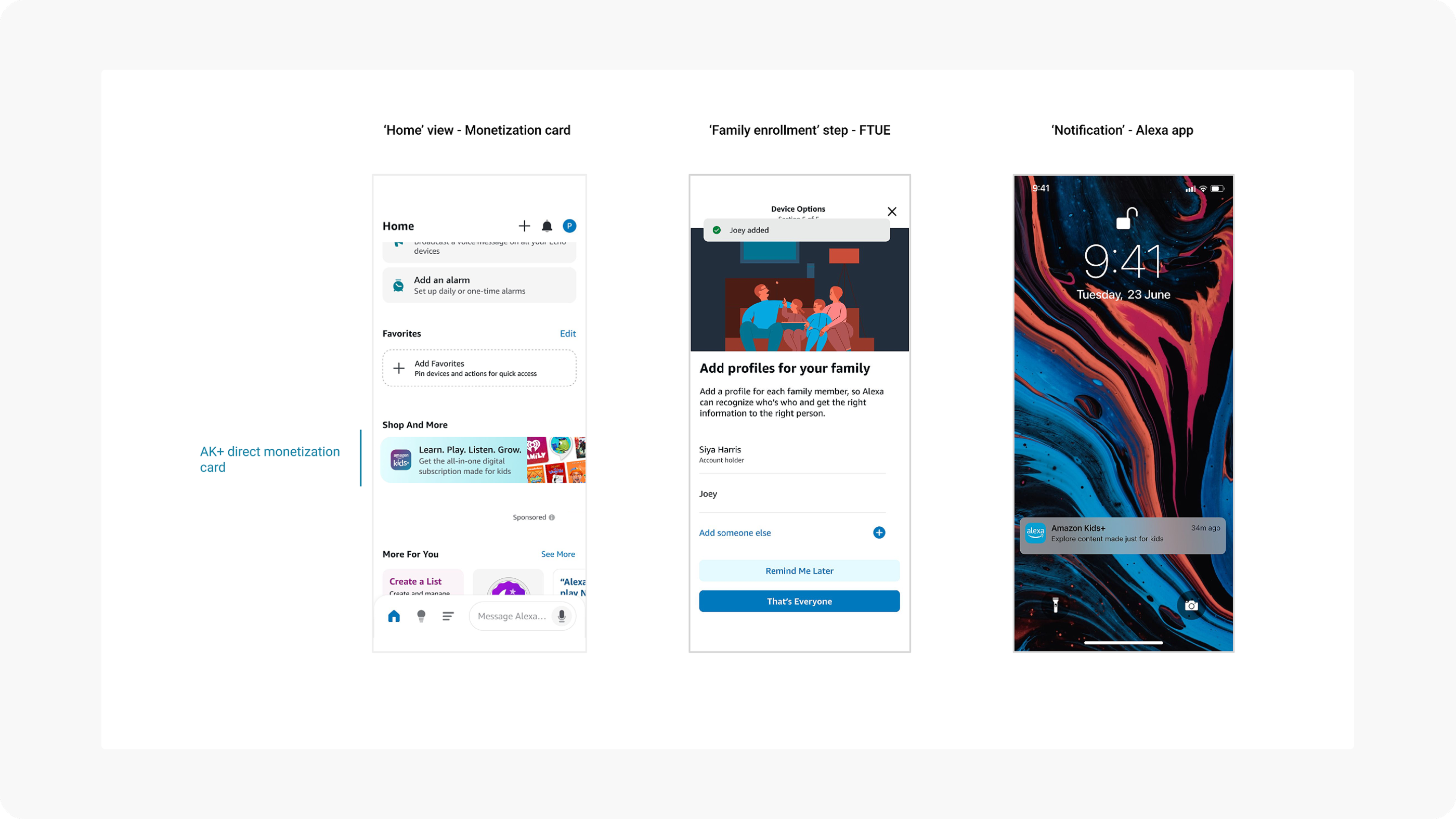
Beyond the primary flows, I identified four additional ingress points within the Alexa app: the Home view monetization card, More options tile, Your Profile “Add a child” flow, and Kids home view in Settings.
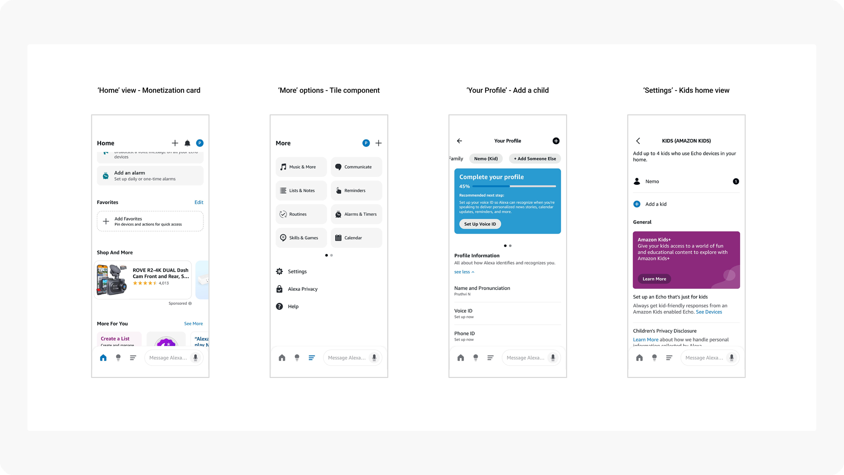
First launch ingress priorities
These three ingress points were selected based on impression data — they offered the highest user visibility to maximize conversions for the first MVP launch.
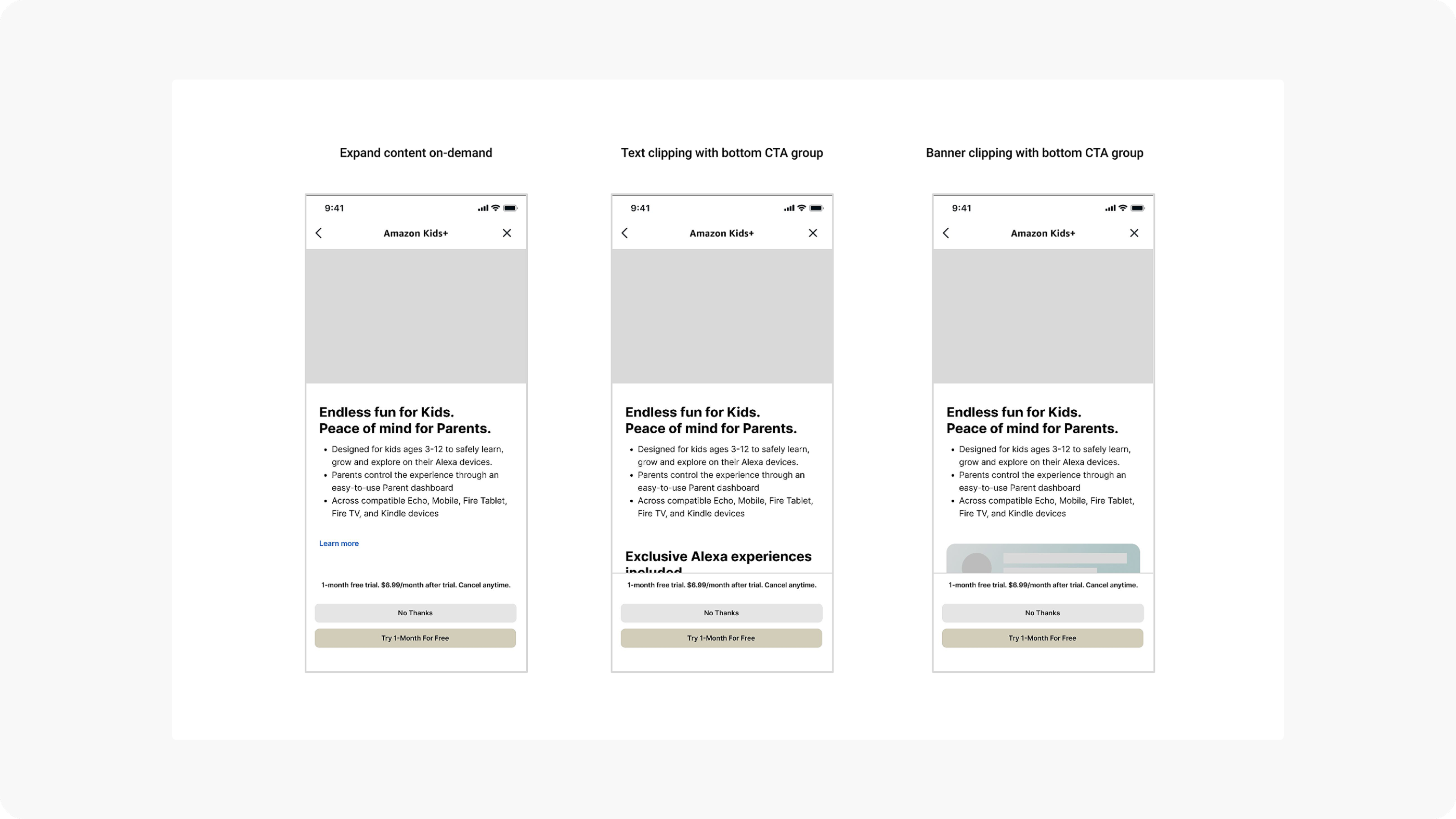
Upsell screen layout explorations
Explored clipping-based layouts to give users a clear signal that content is scrollable below the fold — a crucial affordance that directly addressed drop-off from the first launch.
Wireframe prototype
Early wireframe prototype exploring the upsell page structure and scroll behavior.
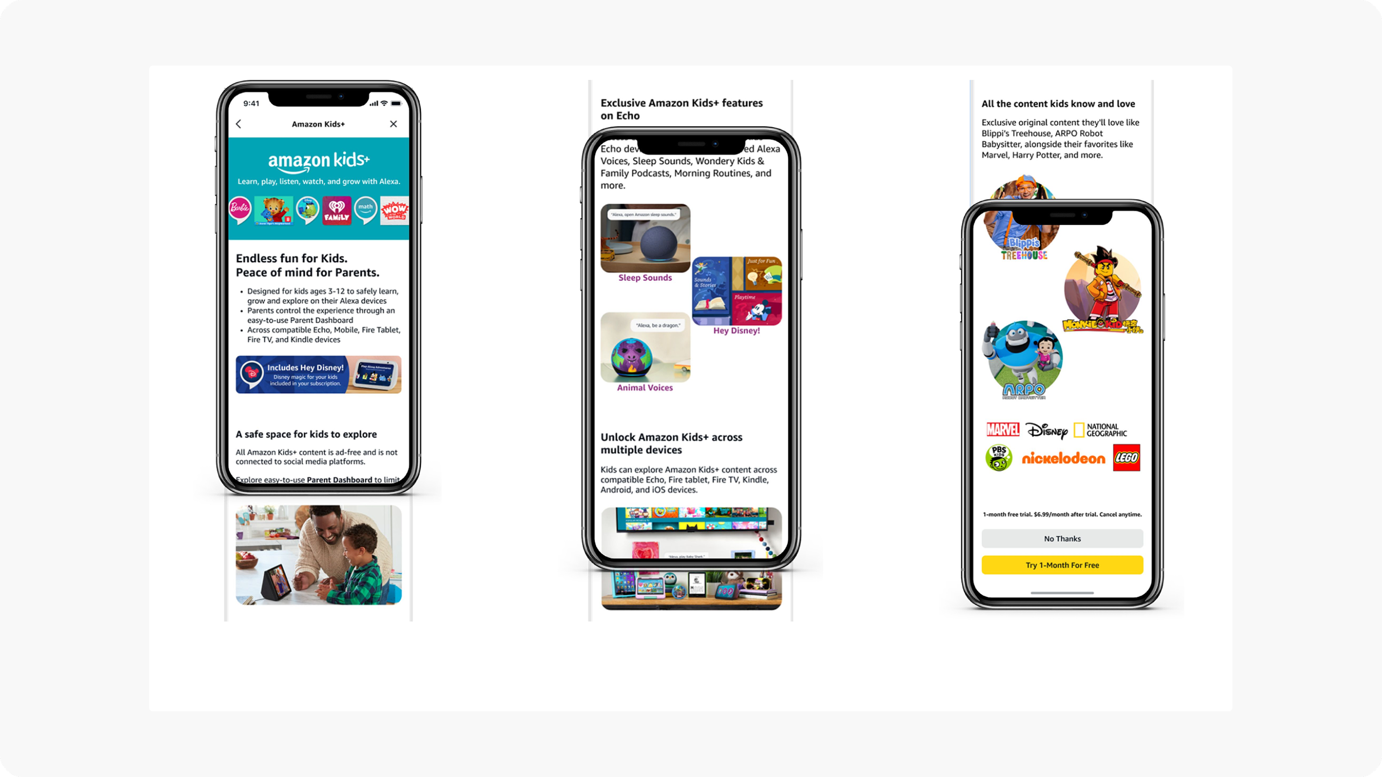
Initial PDP mockups
The initial AK+ Product Detail Page design featured a full-view layout with a sticky bottom CTA group, clearly presenting subscription benefits and pricing.
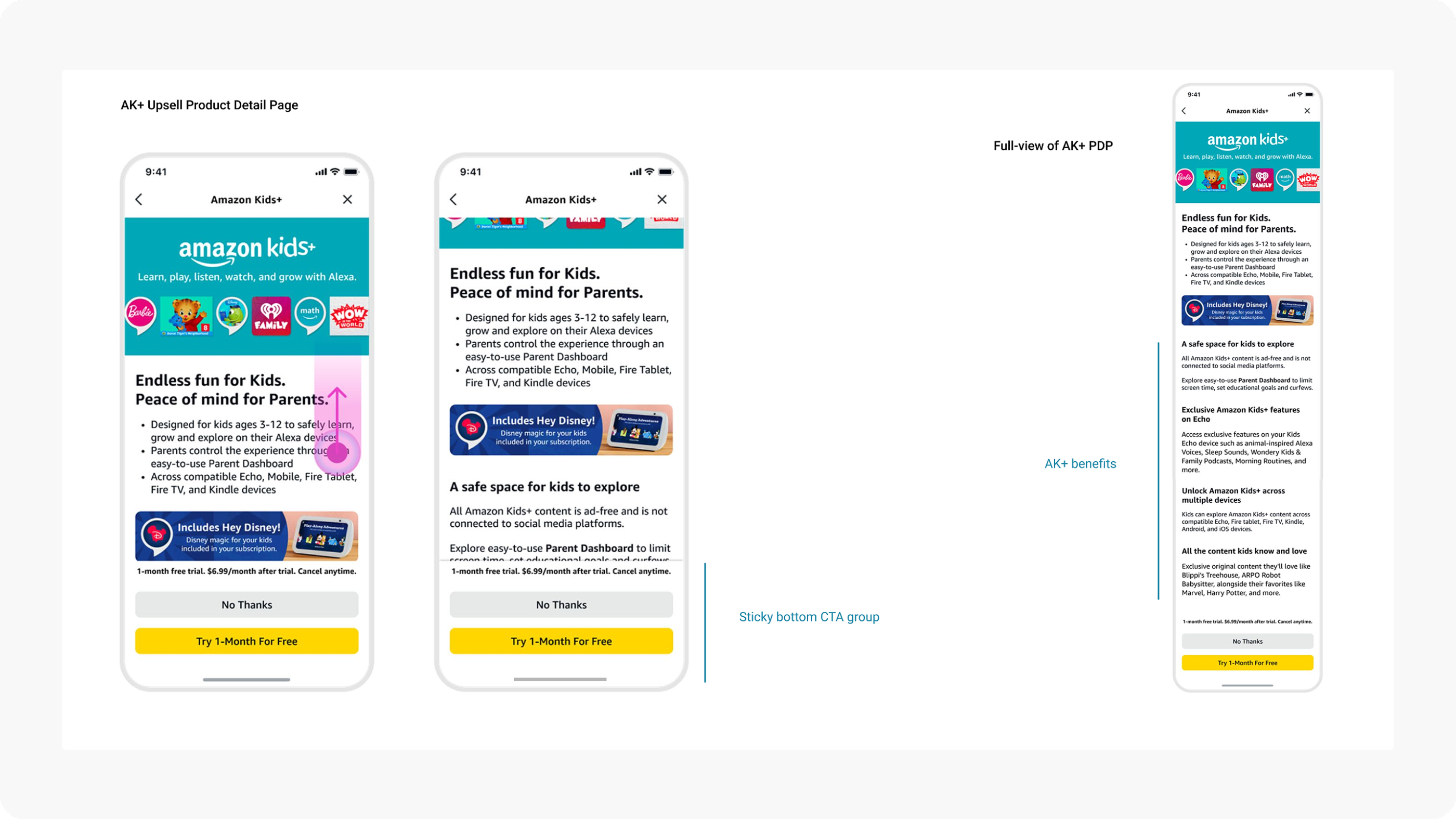
First launch PDP
Learnings from first launch
Open Labs study (Oct 2024) — 8 parents of kids aged 3–12, Echo users, non-AK+ subscribers.
Most parents didn’t realize the upsell page had content below the fold
Ad-free, parental controls, ease of use, child relevance, and cost after trial mattered most
Opportunity to redesign visuals to better communicate AK+ benefits
Design iterations based on learnings
Targeted updates to the PDP screens based on user feedback:
Corner radius and shadow to indicate scrollable content below
Updated Kids branding visuals for banner and benefits sections
Transient vertical scroll hint on load to signal more content below
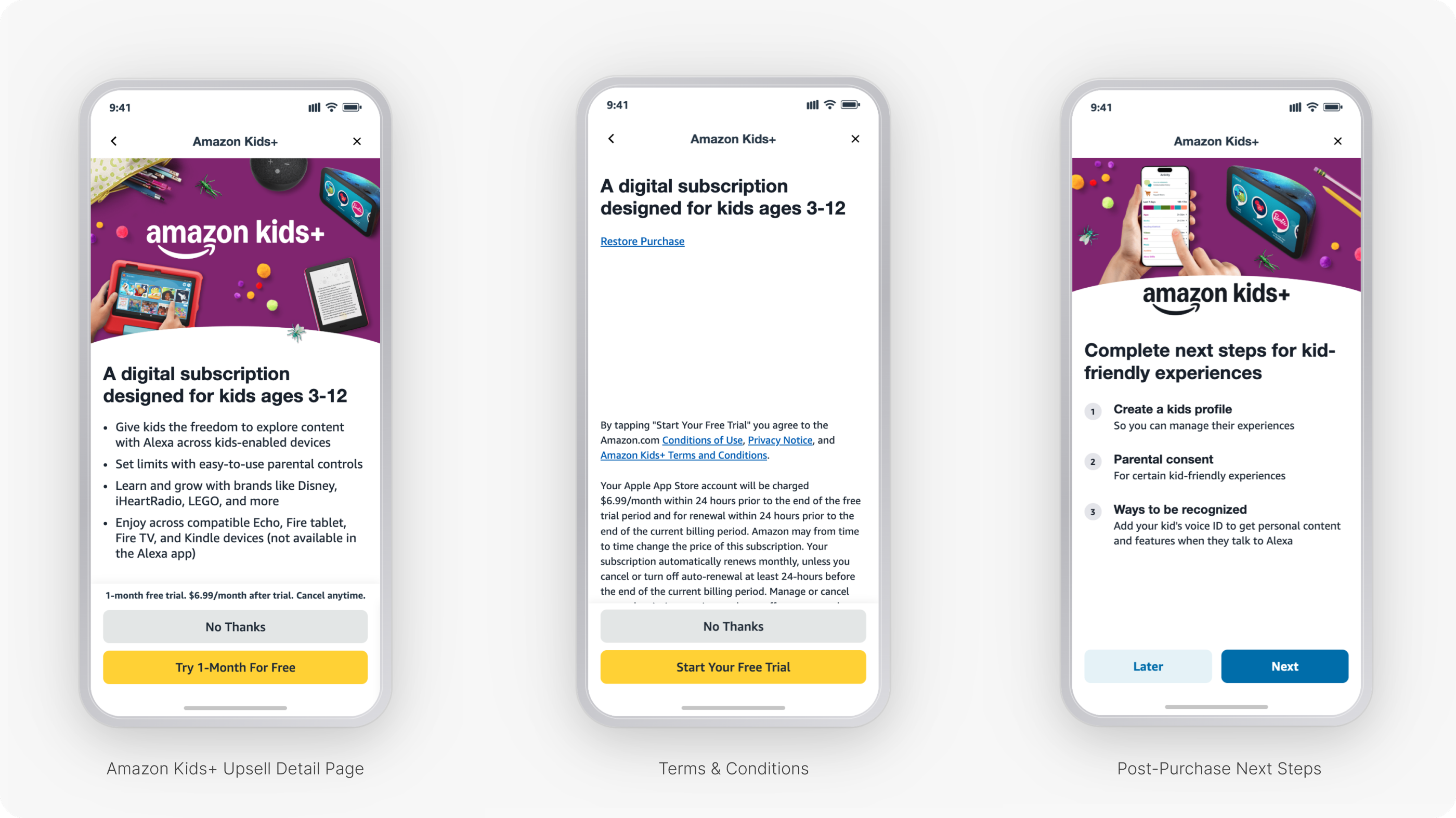
Final Key Screens
Final Flows
Prototype demos
Ingress from Home screen
Localized upsell — German
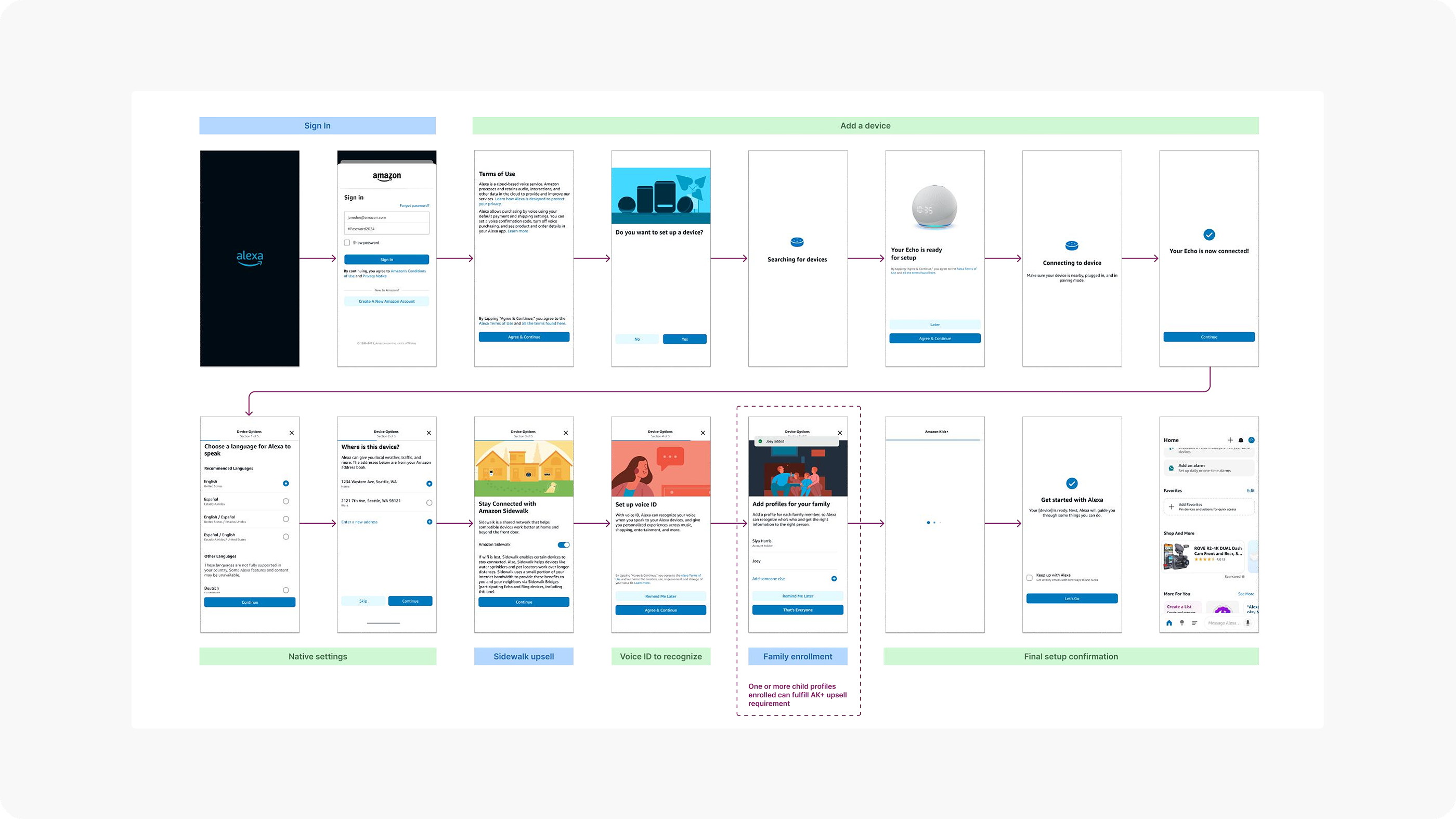
FTUE flow
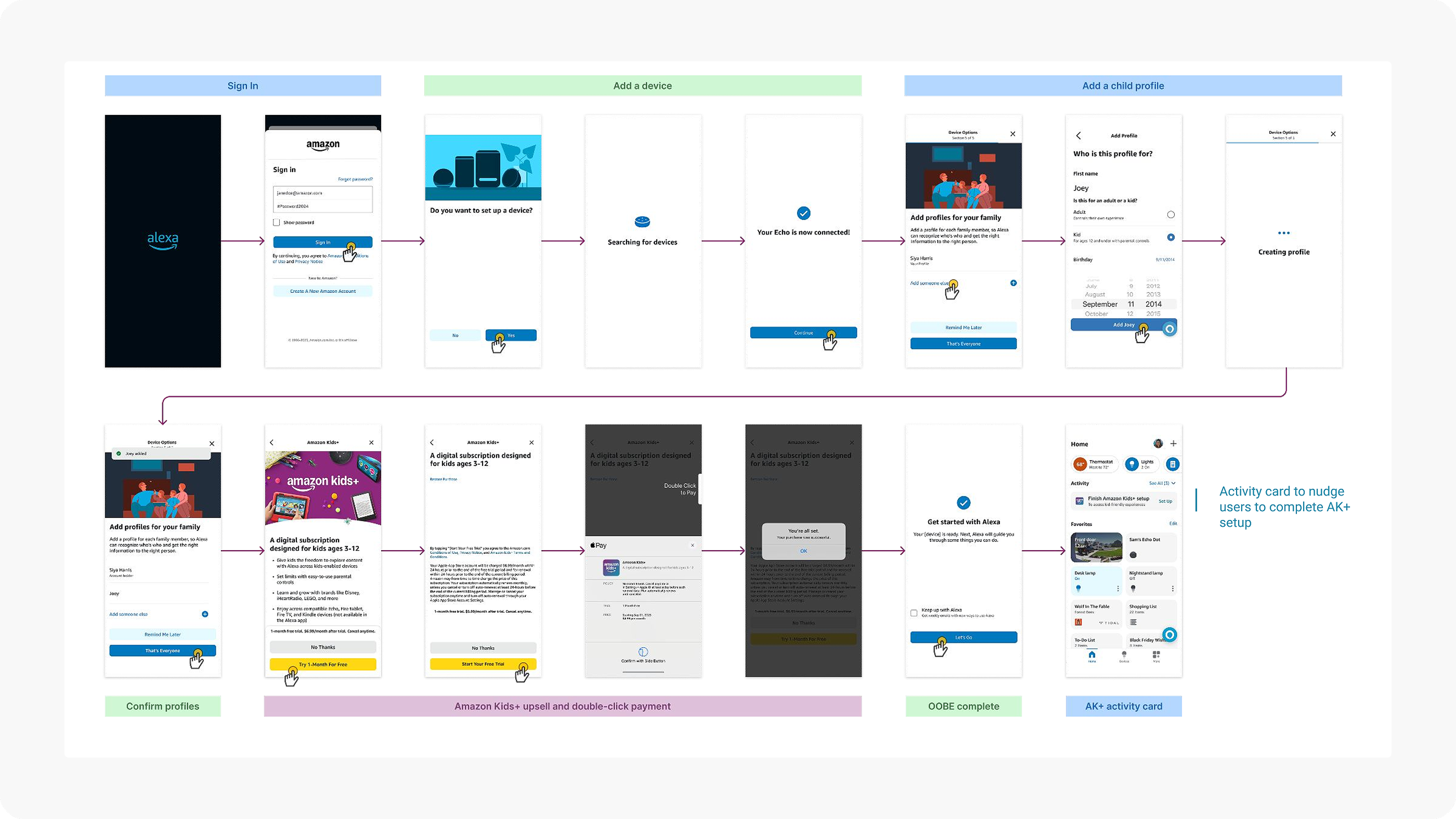
The complete first-time user experience flow — from sign-in through device setup, family enrollment, AK+ upsell with iOS native payment, to OOBE completion — ending with an activity card that nudges users to complete AK+ setup.
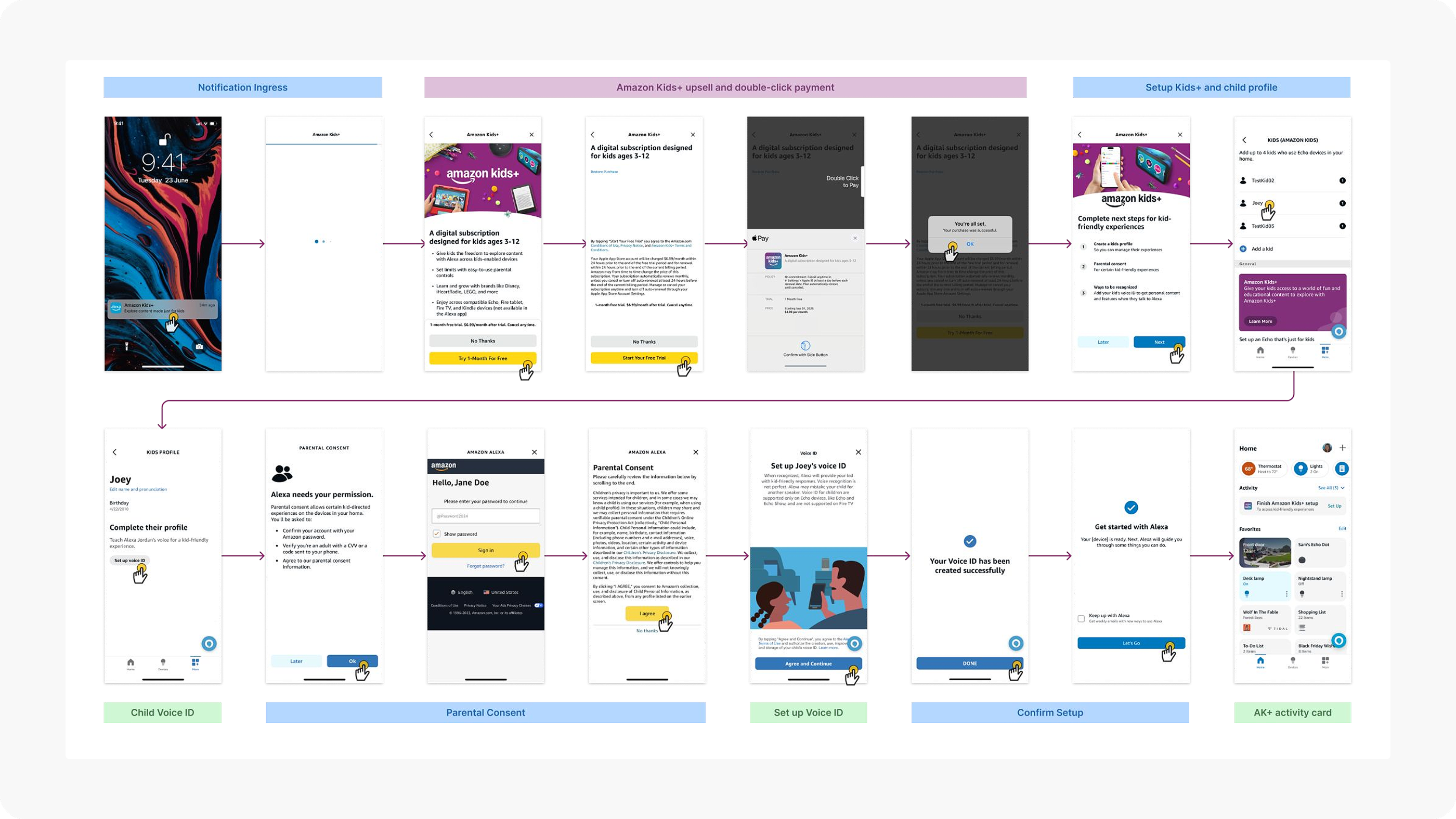
Notification ingress flow
An alternative entry point through push notifications, guiding users from the lock screen notification through the AK+ upsell, payment, child voice ID setup, and setup confirmation — with the activity card reinforcing next steps.
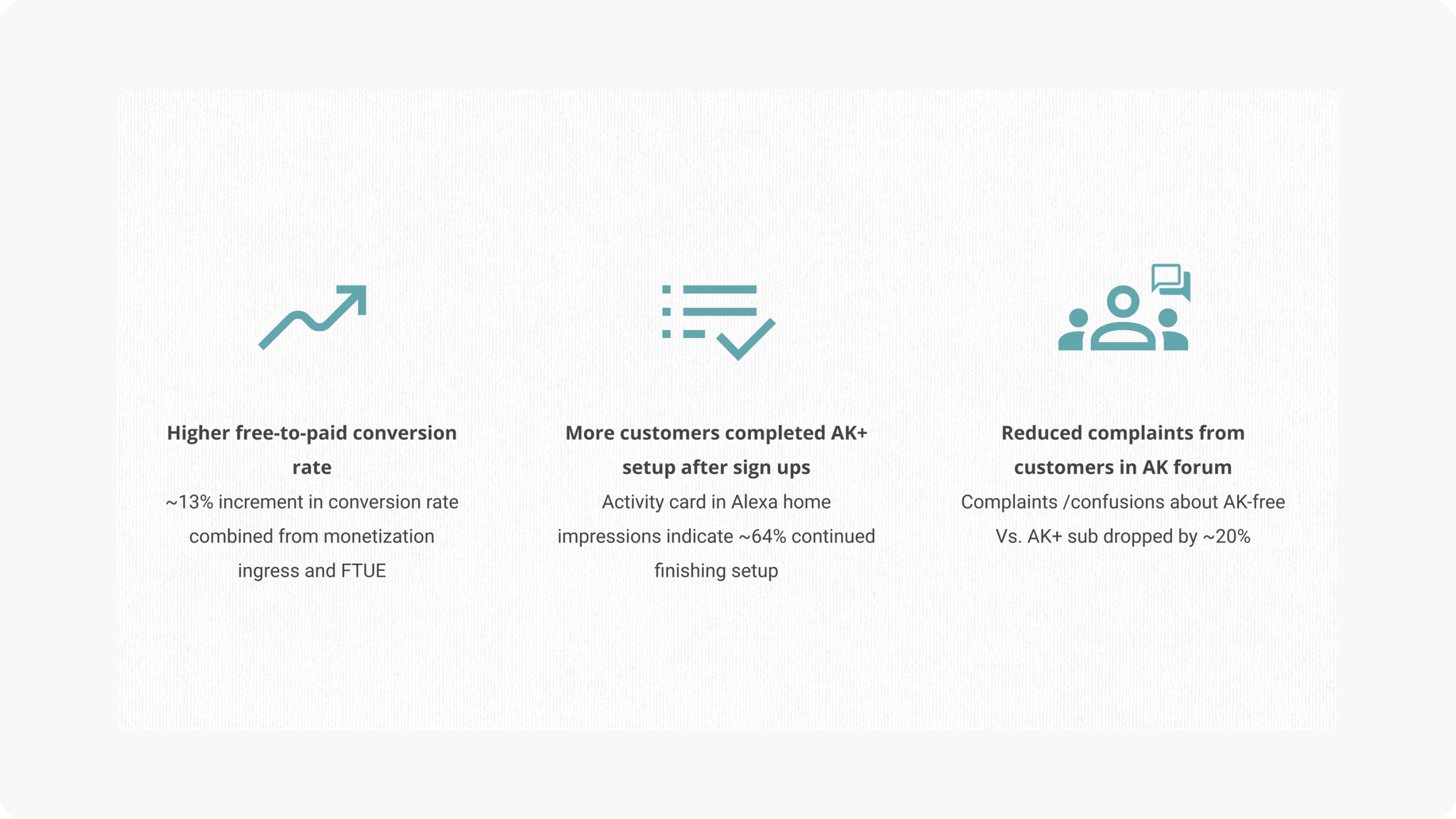
Impact